10
Jun
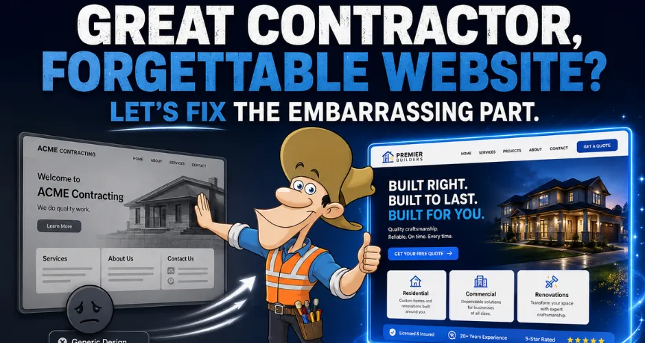
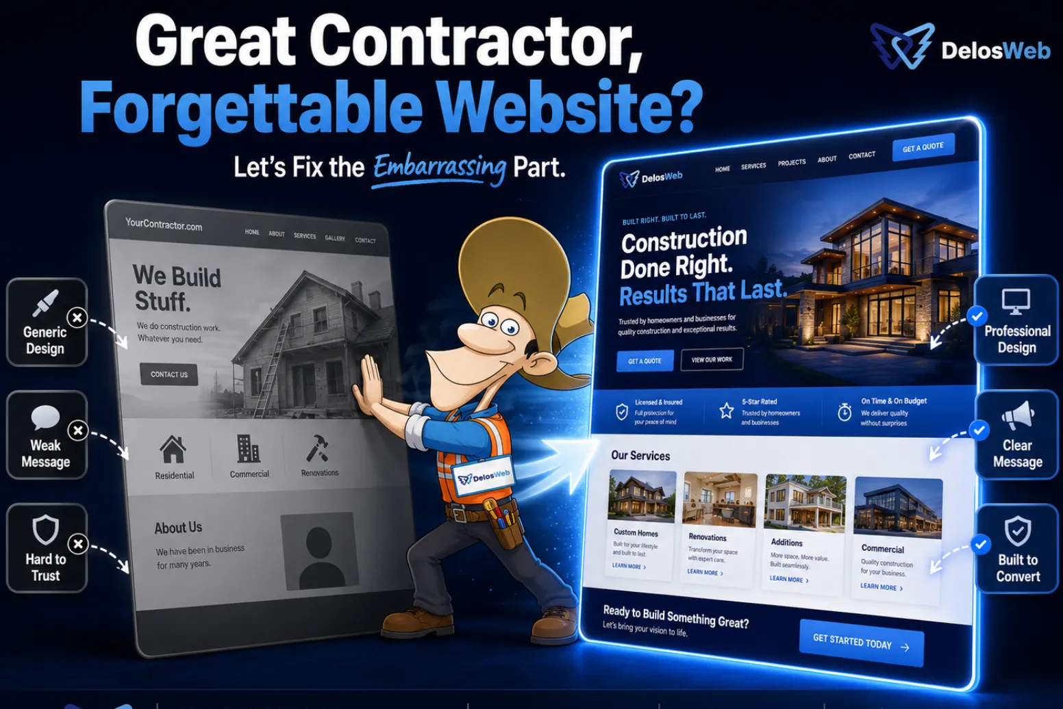
Great Contractor, Forgettable Website? Let’s Fix the Embarrassing Part.
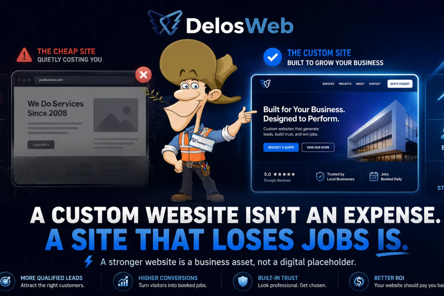
You can be the best contractor in your area and still lose the job before the customer ever calls. Not because your work is bad. Not because your pricing is wrong. Because your website quietly made people wonder if your business is still active, still professional, or still using the same internet from 2011.
Great work deserves a website that makes people believe it. If your craftsmanship is strong but your website looks generic, outdated, slow, confusing, or forgettable, you are creating doubt before the first conversation. And doubt is not exactly known for increasing quote requests.
This is where contractor website design matters. Not “make it pretty and add a slider” design. Real website design. The kind that makes your business look credible, explains your services, builds trust, and guides visitors toward calling, requesting a quote, or starting a project.
Your website is part of your first impression
Customers judge businesses fast online. They scan the headline, photos, layout, buttons, reviews, and overall polish before deciding whether to keep reading or leave. Fair? Maybe not. Reality? Absolutely.
For contractors and service businesses, your website often becomes the first proof that you are organized, trustworthy, and serious. If your website feels weak, customers may assume the rest of your business is weak too. Yes, it is dramatic. Yes, people do it anyway.
A strong first impression should answer:
- What services do you provide?
- Where do you work?
- Can customers trust your business?
- Do you have proof of your work?
- What should the visitor do next?
If your website does not answer those questions quickly, visitors do not politely wait around for clarity. They go back to Google and click the competitor who made things easier.
The embarrassing part: your website may be underselling your work
Many contractors have the same problem: their real-world work looks professional, but their website does not. The projects are solid. The team is capable. The service is valuable. Then the website shows up wearing sweatpants to a business meeting.
A forgettable website does not always look “terrible.” Sometimes it looks fine. That is the tricky part. “Fine” can still fail if it does not make the business memorable, trustworthy, or easy to contact. Fine is not a strategy. Fine is what people say when they do not want to hurt your feelings.
Signs your website is underselling your business:
- Your headline says something vague like “Quality Service You Can Trust.”
- Your services are listed but not explained clearly.
- Your best project photos are hidden, tiny, outdated, or missing.
- Your contact button is hard to find on mobile.
- Your website looks like several competitors’ websites.
- Your pages do not answer common customer questions.
- You get compliments on your work, but not inquiries from your website.
What makes contractor website design different?
Contractor website design is not just about colors, photos, fonts, and making the homepage look “nice.” It is about helping potential customers understand why your business is the safer, clearer, better choice.
A contractor website has to do more than exist. It needs to explain services, show proof, reduce hesitation, support local search visibility, and make quote requests simple. In other words, it needs to work. Revolutionary idea, apparently.
A strong contractor website should include:
- Clear positioning: what you do, who you help, and why it matters.
- Service structure: individual sections or pages for your main services.
- Trust signals: reviews, years of experience, licenses, badges, and project proof.
- Conversion paths: quote buttons, contact forms, phone links, and clear next steps.
- Mobile-first layout: because many customers search from their phones.
- SEO-ready content: headings, internal links, FAQs, and service-focused copy.
Pretty is not the same as persuasive
A website can look modern and still fail. It can have animations, glossy sections, big images, and fancy transitions while saying almost nothing useful. Beautiful silence is still silence.
Persuasive design has a job. It guides visitors through a decision. It shows them what you do, why they should trust you, what makes you different, and how to contact you. If your website only looks nice but does not move people toward action, it is decoration with hosting fees.
Persuasive contractor website design needs:
- A strong headline above the fold.
- Service-specific content that explains real value.
- Project photos placed where they support trust.
- Calls to action near decision points.
- Reviews and proof close to conversion sections.
- Simple navigation that does not make people think too hard.
The anatomy of a website that books more jobs
A lead-focused website is not random. It follows a structure that helps people move from curiosity to trust to action. The goal is not to overwhelm visitors with every detail of your company history. The goal is to help them feel confident enough to reach out.
1. Clear headline and service area
The first screen should tell visitors what you do and where you do it. If someone lands on your website and has to scroll, guess, or decode your business, the design is already making them work. Customers are not solving riddles for fun. They are trying to hire someone.
2. Services organized by customer intent
Your services should be organized the way customers search and decide. A remodeling contractor, for example, may need separate sections or pages for kitchen remodeling, bathroom remodeling, room additions, ADUs, commercial work, and full-home renovations. One vague services paragraph is not enough.
3. Proof that supports trust
Reviews, project images, certifications, badges, experience, and before-and-after examples all help reduce doubt. Customers want proof before they contact you. Saying “we are trusted” is fine. Showing why is better. Wild concept: evidence helps.
4. Calls to action that are impossible to miss
Your website should make the next step obvious. Request a quote. Call now. Start a project. Schedule a consultation. Ask a question. The visitor should never wonder how to contact you. If your CTA is hiding, it is not being humble. It is costing you leads.
5. Mobile experience that actually works
Many people will visit your website from a phone. If your menu is clunky, forms are annoying, buttons are tiny, images load slowly, or text is hard to read, people leave. A mobile-friendly website is not a bonus. It is the minimum entry fee.
Common website design mistakes that cost contractors leads
Most contractor websites do not fail because of one huge disaster. They fail because of several small issues that quietly create friction. The visitor does not announce, “I am leaving because your trust hierarchy is weak.” They just leave. Very inconsiderate of them.
1. Generic headlines
“We provide quality work” may be true, but it does not separate you from anyone. Your headline should explain what you do, who you help, and what kind of outcome customers can expect.
2. Weak service pages
If your service pages are thin, vague, or missing, search engines and customers have less to work with. Strong service pages help people understand your offers and support SEO for the work you actually want.
3. No project proof
Contractors have a visual advantage. Use it. Show projects, before-and-after photos, completed work, process images, or portfolio sections. If your work is strong but invisible online, your website is making your best proof unavailable.
4. Poor contact flow
If customers have to hunt for your phone number, scroll forever to find a form, or click through several pages to ask a question, you are adding friction. And friction is just a polite way of saying “fewer leads.”
5. Slow or outdated mobile layout
A website that loads slowly or breaks on mobile damages trust fast. Customers may not understand the technical reason, but they understand the feeling: this business looks harder to work with than the next one.
Website design vs. website redesign
Sometimes your business needs a new website from scratch. Other times, the problem is that your existing website needs a strategic redesign. A redesign is not just changing colors and pretending that solved the lead problem. It should improve structure, message, trust, SEO, and conversion flow.
A redesign makes sense when:
- Your current website looks outdated or generic.
- Your services have changed, but your website has not.
- Your website gets traffic but very few inquiries.
- Your mobile experience is weak.
- Your competitors look more professional online.
- Your site does not clearly explain why customers should choose you.
SEO matters, but structure comes first
SEO is not just sprinkling keywords into random paragraphs and hoping Google becomes emotional. A contractor website needs search-friendly structure. That means the right headings, service pages, internal links, FAQs, image alt text, page speed, mobile usability, and content that actually answers what customers search.
A better design supports SEO by making content easier to organize and easier to understand. Search engines need clarity. Customers need clarity. Conveniently, clarity helps both.
SEO-friendly contractor website design should include:
- One clear primary topic per page.
- H1, H2, and H3 headings that match search intent.
- Service pages for important offers.
- Internal links between services, blog posts, portfolio, and contact pages.
- FAQ sections that answer real customer questions.
- Descriptive image alt text for project photos and graphics.
- Fast, responsive layouts for mobile and desktop users.
Ready-to-go or custom design: which one fits?
Not every business needs the same website path. Some contractors need a polished website launched quickly. Others need a fully custom design built around a larger brand, deeper strategy, and more competitive market. The right choice depends on your goals, timeline, content needs, and how much you need to stand out.
| Website Path | Best For | Main Benefit | When to Choose It |
|---|---|---|---|
| Ready-To-Go Website | Businesses that need to launch faster | Professional structure without starting from zero | When you need credibility, speed, and a clear online presence |
| Custom Website | Growing brands and competitive service businesses | Strategy, differentiation, stronger design, and deeper conversion flow | When your website needs to stand out and support long-term growth |
| Website Redesign | Businesses with an outdated or underperforming website | Improves message, trust, structure, SEO, and lead flow | When your current site exists but is not helping enough |
What DelosWeb fixes in a forgettable contractor website
DelosWeb builds websites for businesses that need more than a digital business card. We focus on the things that make a website useful: message, structure, trust, SEO readiness, mobile experience, and conversion flow. You know, the small details that determine whether the site generates leads or just quietly pays for hosting.
We focus on improving:
- First impression: your website should look as professional as your work.
- Messaging: visitors should understand your services without guessing.
- Service clarity: your main offers should be easy to find and easy to trust.
- Lead flow: quote requests, calls, and contact actions should be obvious.
- SEO structure: pages should be organized around search intent and customer questions.
- Visual credibility: project photos, trust badges, reviews, and layout should support confidence.
Internal links that support this topic
A good blog should help visitors move toward the right service. This topic connects naturally to DelosWeb’s main website services because a forgettable site may need a faster launch, a custom build, or a strategic design improvement.
- Website Design for businesses that need a stronger first impression and lead-focused layout.
- Custom Websites for companies that need a fully tailored website strategy.
- Ready-To-Go Websites for businesses that need to launch professionally and faster.
- Template vs. Custom Websites if you are comparing website paths.
- Contact DelosWeb to talk about fixing the website that is currently doing the bare minimum.
Final answer: your website should be worth your work
If your business does great work, your website should not make people doubt it. A forgettable website can quietly damage trust, weaken your first impression, and send leads to competitors who simply look more prepared online.
Good contractor website design helps your company look credible, explain services clearly, show proof, answer questions, and make the next step simple. It does not replace your craftsmanship. It helps people believe in it before they meet you.
Your work already looks professional. Your website should stop acting surprised by that.
Ready to make your website look as strong as your work?
DelosWeb builds lead-focused websites for contractors and service businesses that need better first impressions, clearer messaging, stronger trust, and more quote-ready visitors.
Explore Website Design// frequently asked questions
Questions contractors ask before fixing a forgettable website.
No vague design fluff. No “make it pop” therapy session. Just clear answers about contractor website design, redesigns, lead generation, SEO structure, and why a professional website should make your business easier to trust.
Start My WebsiteA good contractor website clearly explains services, builds trust with proof, works well on mobile, uses strong calls to action, supports SEO structure, and makes it easy for potential customers to request a quote or start a conversation.
Common reasons include vague messaging, weak service pages, poor mobile design, slow loading, hidden contact options, missing trust signals, no project proof, and SEO structure that does not match what customers are searching for.
Yes, separate service pages are usually better for both customers and SEO. They allow your website to explain each major service clearly, answer specific questions, show relevant proof, and target more precise search intent.
A redesign makes sense if your website looks outdated, gets few inquiries, feels generic, performs poorly on mobile, lacks clear service structure, or makes competitors look more trustworthy online. The goal is not just a new look. The goal is better performance.
Strong design guides visitors toward action. It uses clear messaging, trust signals, visible quote buttons, helpful service sections, mobile-friendly forms, and project proof to reduce hesitation and make contacting your business easier.
A ready-to-go website can be enough when a contractor needs a professional website launched faster with a strong structure. A custom website is better when the business needs deeper branding, stronger differentiation, advanced content, or a more tailored conversion strategy.
A contractor homepage should include a clear headline, service area, main services, trust signals, project proof, reviews, process summary, strong calls to action, FAQs, and easy contact options. It should tell visitors why they should trust you fast.
Yes. DelosWeb can redesign or rebuild an existing contractor website to improve messaging, service structure, visual credibility, SEO readiness, mobile experience, and conversion flow. In other words, we help the website stop quietly embarrassing the work.