12
Jun
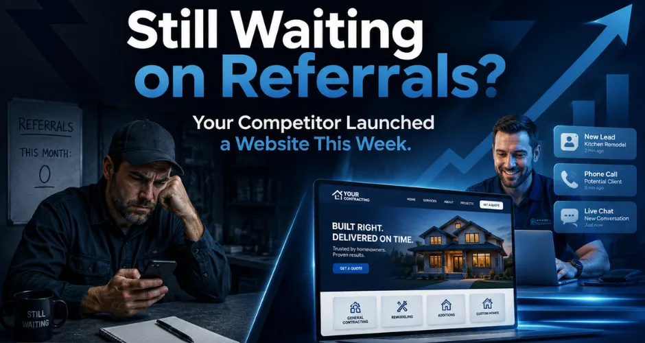
Your Website Has 50 Milliseconds to Not Look Sketchy.
People judge websites fast. Very fast. Before they read your beautiful paragraph about quality service, before they admire your company history, and before they lovingly analyze your footer links, they already have a first impression.
If your website looks outdated, confusing, slow, cluttered, or untrustworthy, visitors may leave before your business ever gets a real chance. Fair? Maybe not. But customers are not grading effort. They are deciding whether your company looks safe enough to contact.
This article covers the web design mistakes that cost leads and how to fix them before your website continues doing its favorite hobby: making people disappear.
First impressions happen before the first call
Your website is often the first place a customer judges your professionalism. If the design feels polished, organized, and clear, the business feels more credible. If the design feels messy or outdated, the business may feel risky.
Customers may not say, “This website has weak visual hierarchy.” They just feel uncertain. Then they click away. Very rude, but very common.
Your website should immediately communicate:
- What your business does.
- Who you help.
- Why visitors should trust you.
- What action they should take next.
- Whether your company looks professional enough to contact.
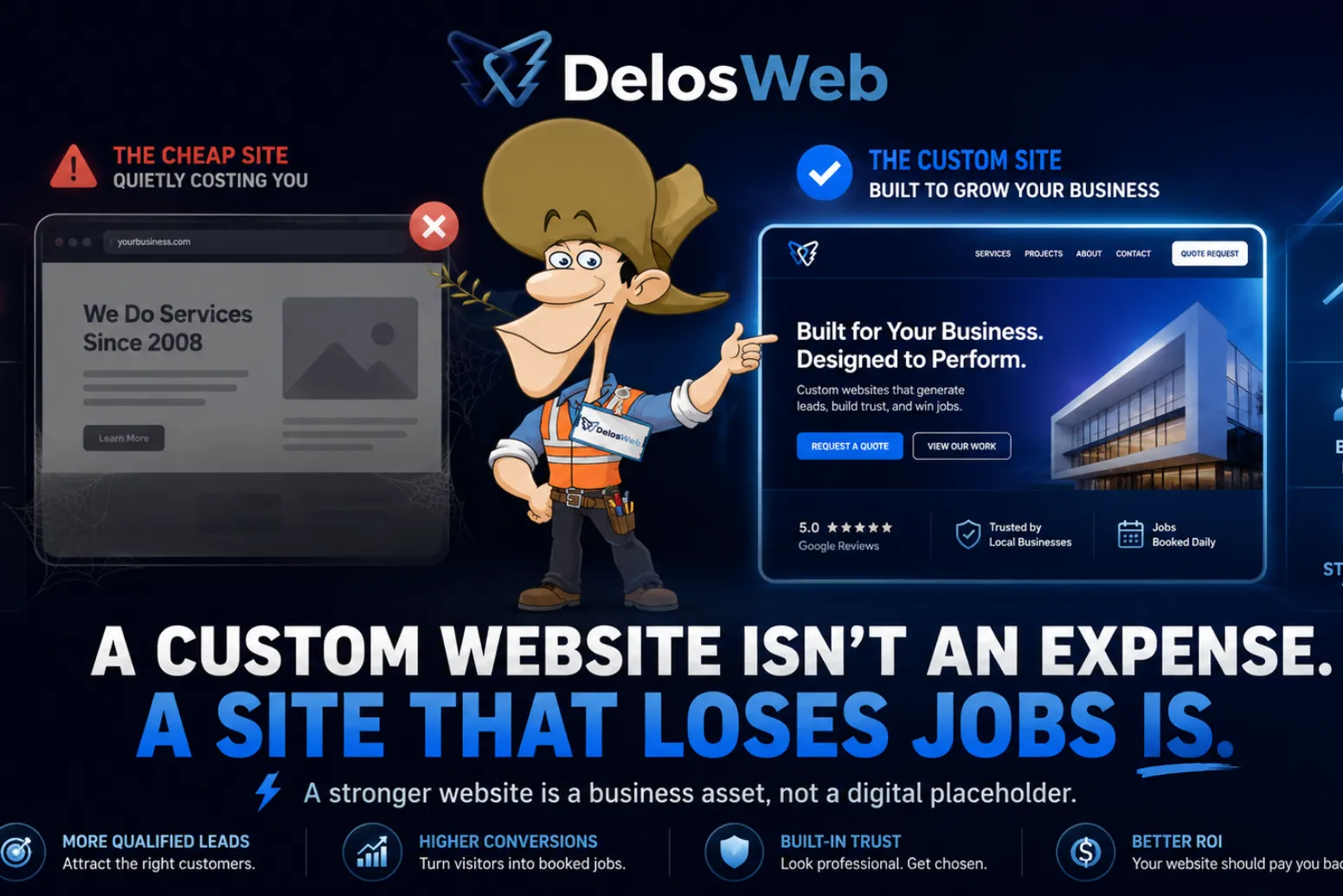
Mistake #1: Your website looks outdated
An outdated website can make a solid business look behind, inactive, or less trustworthy than it actually is. That is painful because the quality of your work may be excellent, but customers only see the digital first impression.
If your site still feels like it was designed when “click here” buttons were considered luxury technology, visitors may assume your business is not paying attention. Not ideal when competitors are showing modern, mobile-friendly websites with clear service pages and easy quote requests.
Signs your website may look outdated:
- Old design style, heavy shadows, or cluttered layouts.
- Small text that is hard to read on mobile.
- Low-quality images or stretched photos.
- Too many random sections with no clear flow.
- Old icons, outdated buttons, or inconsistent spacing.
Mistake #2: Your headline is vague
The top of your website should explain what you do quickly. A vague headline like “We Bring Your Vision to Life” sounds nice, but it could apply to a contractor, a photographer, a candle shop, or someone selling inspirational mugs.
Clear beats clever when the visitor is trying to decide whether your business can solve their problem. You can still sound polished, but the message needs to be specific.
A stronger website headline should clarify:
- Your main service or service category.
- Your target customer or industry.
- Your value or main outcome.
- The next step, such as requesting a quote or consultation.
Mistake #3: Your layout makes people work too hard
Visitors should not need detective skills to understand your website. If your services are buried, your contact button is hiding, your sections feel random, or your homepage jumps from topic to topic, people leave.
A good website creates a simple path: understand the business, review the services, build trust, see proof, answer questions, and contact the company. Revolutionary? No. Effective? Yes.
A better page structure usually includes:
- A clear hero section with a strong message and CTA.
- Service sections that are easy to scan.
- Trust elements close to decision points.
- Project proof or examples where relevant.
- FAQs that answer objections before the first call.
- Contact options repeated naturally throughout the page.
Mistake #4: Your calls to action are weak
A website without strong calls to action is like a salesperson who explains everything and then walks away. The visitor may be interested, but if the next step is unclear, you lose momentum.
“Submit” is not exactly inspiring. Neither is hiding one contact form at the bottom like it is a secret bonus level. If you want calls, quotes, consultations, or messages, your website needs to guide people there.
Strong CTAs should be:
- Clear, simple, and action-focused.
- Placed near important sections.
- Visible on mobile.
- Connected to the visitor’s intent.
- Repeated without feeling spammy.
Mistake #5: Your website does not build trust
Customers do not automatically trust a business because it has a website. The website has to earn that trust. That means showing proof, answering questions, explaining the process, and making the company feel real.
If your website says “professional service” but has no reviews, no project examples, no process, no FAQs, and no clear contact details, the visitor is left guessing. And when people guess online, they usually guess their way over to a competitor.
Trust-building elements can include:
- Reviews or testimonials.
- Project photos or portfolio examples.
- Clear service descriptions.
- Process steps that explain what happens next.
- FAQs that reduce hesitation.
- Professional branding, consistent visuals, and real contact information.
Mistake #6: Your mobile version feels like an afterthought
Many visitors will see your website from a phone. If the mobile version is hard to read, slow, crowded, or annoying to use, your website can lose leads even if the desktop version looks decent.
Mobile design is not just shrinking the desktop site and hoping everyone has patience. The layout needs to be easy to scan, buttons need to be tappable, forms need to be simple, and important information needs to appear quickly.
A mobile-friendly website should have:
- Readable text without zooming.
- Fast-loading sections and optimized images.
- Easy-to-tap buttons.
- Clear navigation.
- Visible contact options.
- A simple path from interest to inquiry.
Mistake #7: Your content says everything and nothing
Many business websites use the same safe phrases: quality service, experienced team, customer satisfaction, affordable pricing, reliable results. Those phrases are not wrong. They are just not enough.
Your content should explain what you do, how you help, what customers can expect, and why your business is a strong choice. Generic copy makes your company sound replaceable. Specific copy builds confidence.
Better website content should explain:
- What services you provide.
- What problems those services solve.
- What makes your process easier or more reliable.
- What type of customers you serve.
- What someone should do after reading the page.
Mistake #8: Your website ignores SEO structure
A website can look beautiful and still be hard for search engines to understand. SEO is not only about keywords. It is about structure, headings, page organization, internal links, image alt text, metadata direction, and helpful content that matches real search intent.
If your service business wants more visibility, the website needs pages and sections that make sense to both humans and search engines. Keyword stuffing is not the answer. Clear structure is.
SEO-ready website design should include:
- A clear H1 focused on the page topic.
- Helpful H2 and H3 sections.
- Service-focused content that answers real questions.
- Internal links between related pages.
- Descriptive image names and alt text.
- FAQs that support search visibility and user confidence.
Website design mistakes and what they cost
The problem with web design mistakes is that they do not always look dramatic. Sometimes the website still “works.” It loads. It has pages. It has a contact form. It looks fine. Fine is dangerous because fine does not always convert.
| Design Mistake | What It Causes | Better Fix |
|---|---|---|
| Outdated visuals | Lower trust and weaker first impression | Modern, clean, professional design |
| Vague headline | Visitors do not understand the business quickly | Clear message focused on service and outcome |
| Weak CTA | Interested visitors do not take action | Strong quote, call, or consultation prompts |
| Poor mobile layout | Phone users leave before contacting | Responsive mobile-first structure |
| No trust signals | Visitors hesitate or compare competitors | Reviews, proof, process, FAQs, and clear contact details |
| No SEO structure | Lower visibility and weaker page relevance | Headings, internal links, service content, and metadata direction |
How DelosWeb fixes weak website design
DelosWeb builds websites that are designed to look credible, explain services clearly, and guide visitors toward action. We do not treat design as decoration. Design should support trust, structure, SEO, and conversion.
That means the website needs to be planned around the user’s decision process, not just around what looks cool in a template demo. Cool is nice. Leads are nicer.
Our website design approach focuses on:
- First impressions: making the business look professional quickly.
- Clear messaging: helping visitors understand services without confusion.
- Lead flow: placing CTAs where they support the next step.
- Trust: adding proof, process, reviews, FAQs, and credibility sections.
- SEO-ready structure: organizing content so search engines and customers understand it.
- Mobile usability: making the site easy to use on phones, tablets, and desktops.
Internal links your website should use
A strong blog should support the rest of your website. This topic connects naturally with service pages about website design, custom websites, and ready-to-go websites. The goal is to help visitors compare their options and move toward the right next step.
- Website Design for better first impressions, trust, and lead-focused layouts.
- Custom Websites for businesses that need deeper strategy and a fully tailored build.
- Ready-To-Go Websites for businesses that need a professional launch faster.
- Contractor Website Design That Books More Jobs for a related article on better contractor website structure.
- Contact DelosWeb to talk about fixing a website that is losing leads.
Final answer: do not let your website look sketchy
Your website does not get unlimited time to explain itself. Visitors decide quickly whether your business feels professional, trustworthy, and worth contacting. If the design creates doubt, that doubt can cost leads.
Strong website design is not about showing off. It is about making the business easier to trust, easier to understand, and easier to contact. When your website does that well, it becomes more than a digital brochure. It becomes part of your sales process.
So yes, your website should not look sketchy. Ambitious goal, we know. But for a business that wants more leads, it is a pretty good place to start.
Ready to fix the embarrassing part?
DelosWeb Website Design helps service businesses look credible, communicate clearly, support SEO, and turn more visitors into quote requests.
Explore Website Design// frequently asked questions
Questions business owners ask when their website is quietly losing leads.
No vague design lectures. No “make it modern” without a plan. Clear answers about web design mistakes, first impressions, trust, SEO structure, and why a website that looks sketchy can cost real inquiries.
Start My WebsiteCommon mistakes include outdated visuals, vague headlines, weak calls to action, poor mobile layout, missing trust signals, confusing navigation, generic content, and weak SEO structure.
First impressions matter because visitors quickly decide whether your business feels credible, professional, and worth contacting. A weak first impression can cause people to leave before they understand your services.
Your website can build trust with clear messaging, professional design, reviews, project proof, process details, FAQs, visible contact options, mobile-friendly layout, and consistent branding.
Many visitors search from phones. If your mobile website is slow, hard to read, difficult to tap, or confusing to navigate, people may leave before calling or requesting a quote.
Yes. Better website design can support SEO through clear heading structure, service-focused content, internal links, optimized images, FAQs, better mobile usability, and a clearer page hierarchy.
If your website technically works but does not generate leads, looks outdated, has weak messaging, or makes competitors look more trustworthy, a redesign may be a smart move.
Yes. DelosWeb can redesign or rebuild a weak website with stronger messaging, better layout, clearer services, trust-building sections, mobile-friendly design, SEO direction, and lead-focused structure.